Insightful design for intelligent control
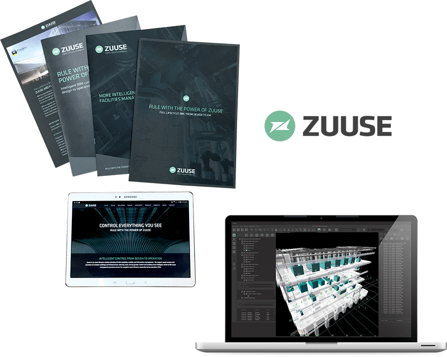
Zuuse, a powerful BIM software solution designed to scale across the entire lifecycle of assets, from buildings to bridges. A single integrated platform that collects every bit of data from design to demolition, but it was missing one thing… a personality.
Sin created a sophisticated brand with a unique personality, a vehicle that carries everything from print collateral and digital presence to the software platform itself. Zuuse is now a major player in asset lifecycle & facilities management field with a look to match.
Industry
What we did
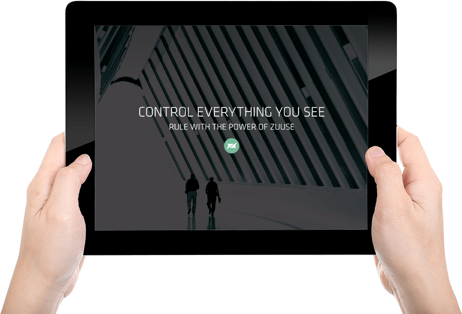
Positioning & USP - a story of power & control
The brand positioning resonates with meaning that reinforces the name Zuuse without sounding mythological. But just like the mythical Zeus, the Zuuse story is one of ruling, power, and control. Control everything you see.
Although Zuuse has many features and advantages over its competitors, the USP focuses on the core of what using Zuuse will deliver to its clients. One single point of truth to control every piece of data connected to the asset from design to operation. Rule with the power of Zuuse.
When a pretty face just isn’t enough
For such a sophisticated product, there had to be a brand to match, the existing brand (ArtRA) was simply not going to cut it. Zuuse approached Sin to establish a strong presence in a fast-growing market. As the new guys on the block, it wasn’t enough to just look good, Zuuse required some heavy-duty thinking to create the correct strategy to enter the marketplace. Zuuse was born. A clean, high-end brand with a strong emphasis on a simple tone of voice. A clear verbal language was vital; Zuuse had to deliver complex industry jargon to an uneducated audience in an easily digestible format.
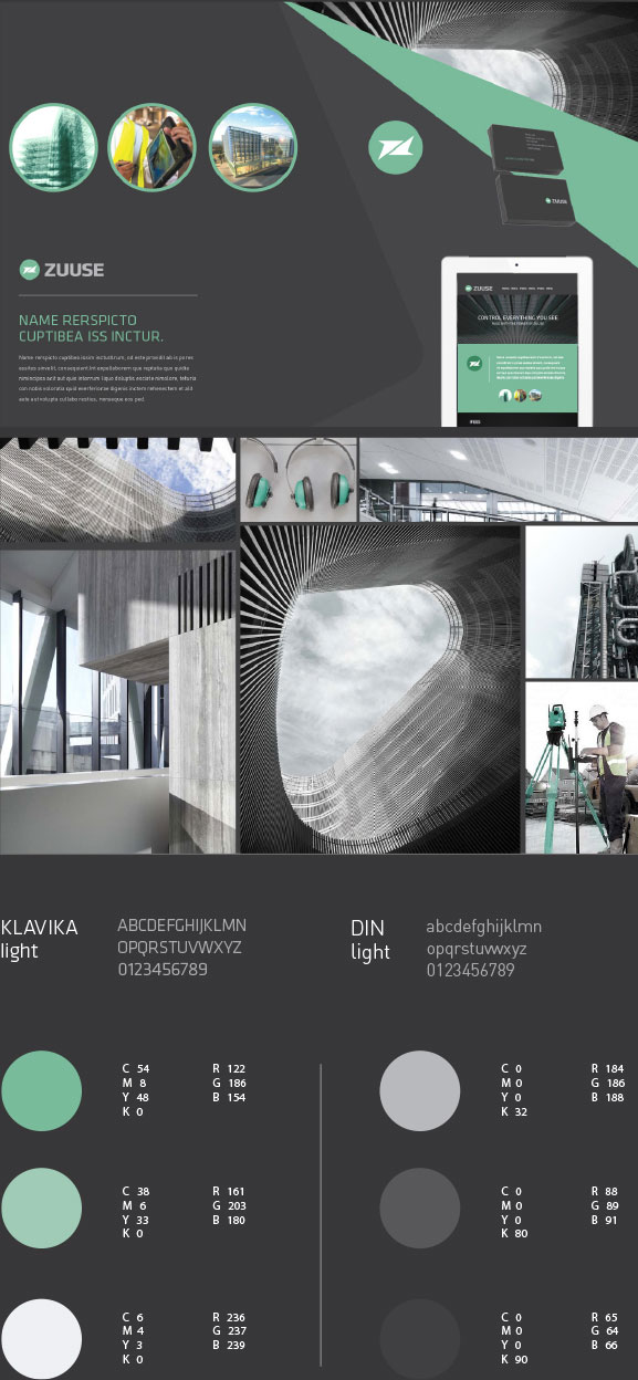
Brand transformation
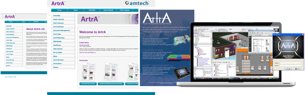
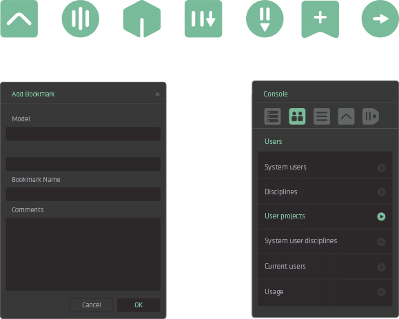
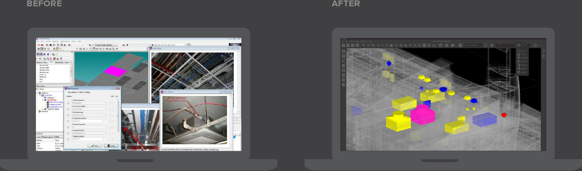
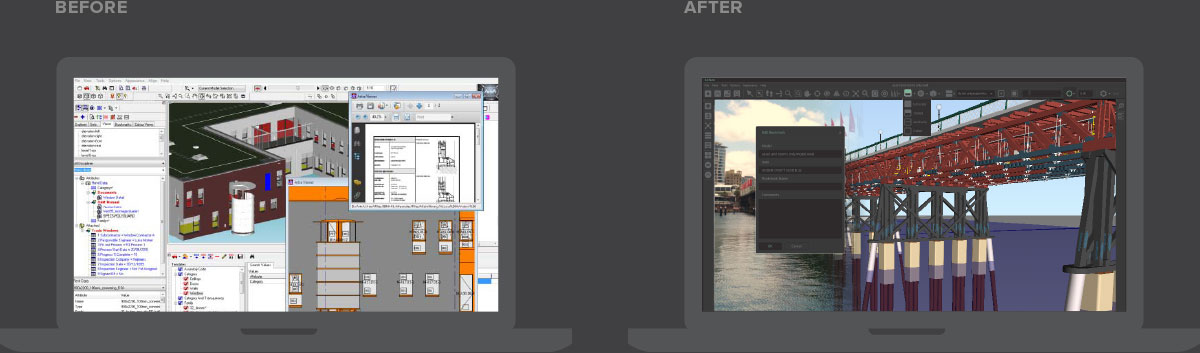
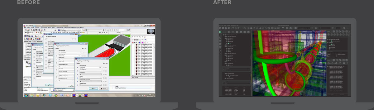
Software design - from clutter to clean
With the branding complete, the next phase was to redesign the existing software interface. The UI/UX was showing its age, super complicated, hard to navigate and not at all easy on the eye. The entire UI/UX and skin were overhauled, from fonts to iconography, the result, a modern user interface with simplified usability.
From boffins to beginners
The focus was to make Zuuse easy to use. With BIM being such a new technology, most users were likely to be new users. The old Artra interface was so complicated, only the most tech-savvy boffin could work it out. Now, the new friendlier, streamlined interface not only looks great, it’s intuitive, easy to navigate and a pleasure to use.
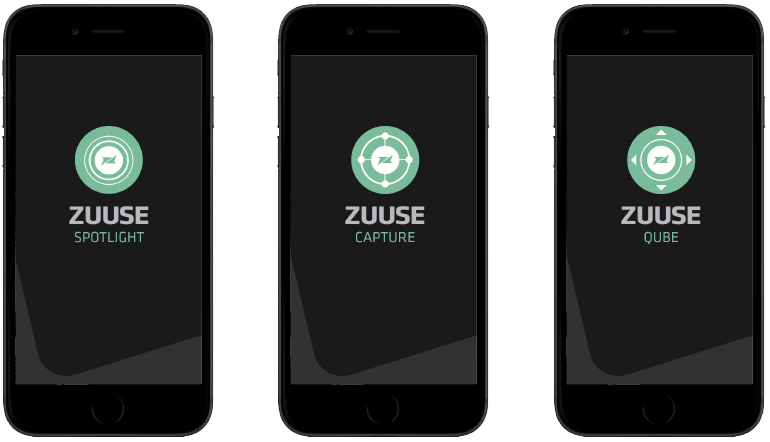
A growing family
The successful Zuuse brand continues to grow. Sin works closely with Zuuse designing any new additions to the family. Zuuse now has a range of smartphone and tablet apps for use in the field. For each new product, a name and logo are required. The app icons all feature the central Zuuse ‘Z’ with the external elements representing the products core functionality. This close attention to detail helps keeps the Zuuse family close and the brand memorable.