A departure from traditional thinking
To stay one step ahead of the opposition and new players in the market, Leap Migration Manager decided it was time to re-brand and reposition, that’s where Sin comes in. It was clear to us they needed to break away from the stale corporate look and reposition themselves as the go-to, user-friendly leaders of Australian migration agent software.
Industry
What we did
The leap from corporate cliche to modern tech
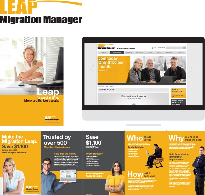
The existing Leap brand focused more on migration law and the software’s endless feature list. Its corporate feel and tone of voice was too complex and not getting the point across to new and existing agents. We took the approach modern software and tech companies are starting to adopt. Take Xero for example, even though the product is feature rich and complex, it’s never pushed, they choose a more human approach. Through simple messaging, it makes you feel the product is easy to use and will speed up the working day. This philosophy was applied to take Migration Manager, to break the industry mould and take Migration Manager to new heights.
Before

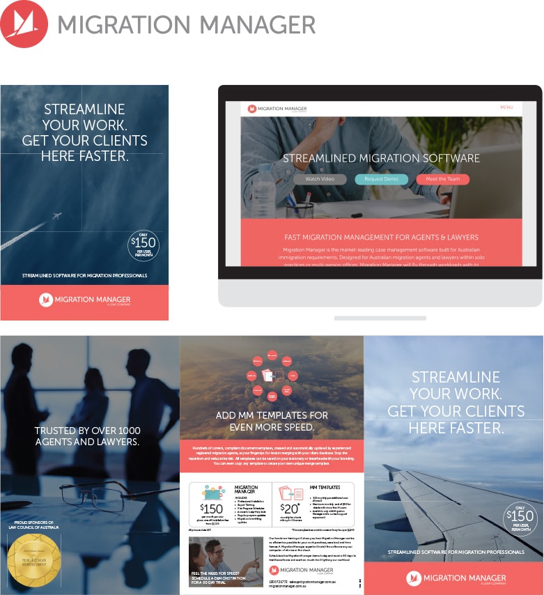
After

Easy to use, easy to consume
The verbal language and tone of voice needed to reflect the easy to use, time-saving software. It also had to explain the sometimes complex messages easily. Sin developed a friendly tone of voice that plays homage to the speed of the software and the time it can save users. It also plays on the migration aspect and borrows from the airline industry.
MIGRATION MANAGER
FIRST-CLASS MIGRATION SOFTWARE
SUPREME SUPPORT
YOU’RE NEVER FLYING BLIND
MIGRATION MANAGER
HAS OVER 1000 MIGRATION AGENTS FLYING

Brand development
Logo
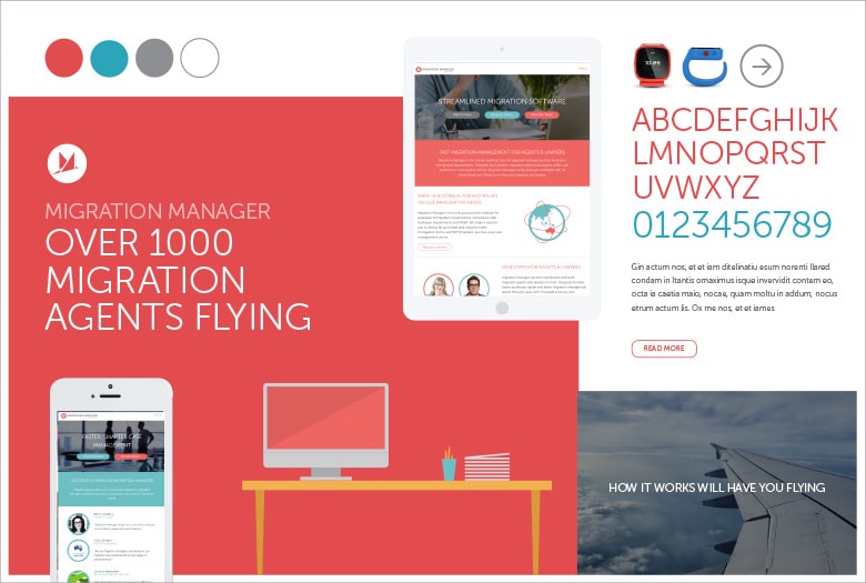
The new logo had to reflect the simplistic, easy to use technology. We also wanted to apply the migration, flight and speed concept. The flying M icon was created to embrace all three aspects. The result is an understated yet memorable mark.
Storyboard

Colour palette
The palette is simple yet striking and purposefully removed from the drab looks of its competitors. It’s fun and inviting.
Typography
While the new brand is friendly, it’s still a serious product. A typeface that delivered a strong message without shouting was needed.

Illustration
The illustration style was key to achieving the ‘accessible to anyone technology’ look. Sticking mainly to the minimal colour palette, the illustrations are used to help explain complex information easily.

Photography
Photography was never meant to take a leading role in the new brand. It would be a vehicle used to carry and enhance the messaging. Tightly cropped, deep-toned images were the ideal base to let the messages sing.


