The challenge
Sin was approached by a team of health professionals looking to start a chain of bespoke sleep clinics. The new clinics would focus purely on sleep disorders with a unique approach. A team of health professionals working together across a range specialised services to help improve each client’s whole health, which improves their sleep health.
Being a new, specialised sleep service, a strong brand and a clear strategy with a focus as unique as the business model itself was needed.
Industry
The wrong side of the bed. Switching the focus from hindrance to health.
Throughout our research, it was clear that most sleep disorder clinics and services followed the same strategy, and the sufferer is not who you’d think. The common pitch was based around annoyed and sleep deprived partners, and what a nuisance the real sufferer is. We believed this was the wrong approach focusing on the person, there was no sign of help for actual sleep disorder sufferer.
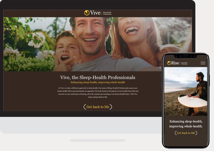
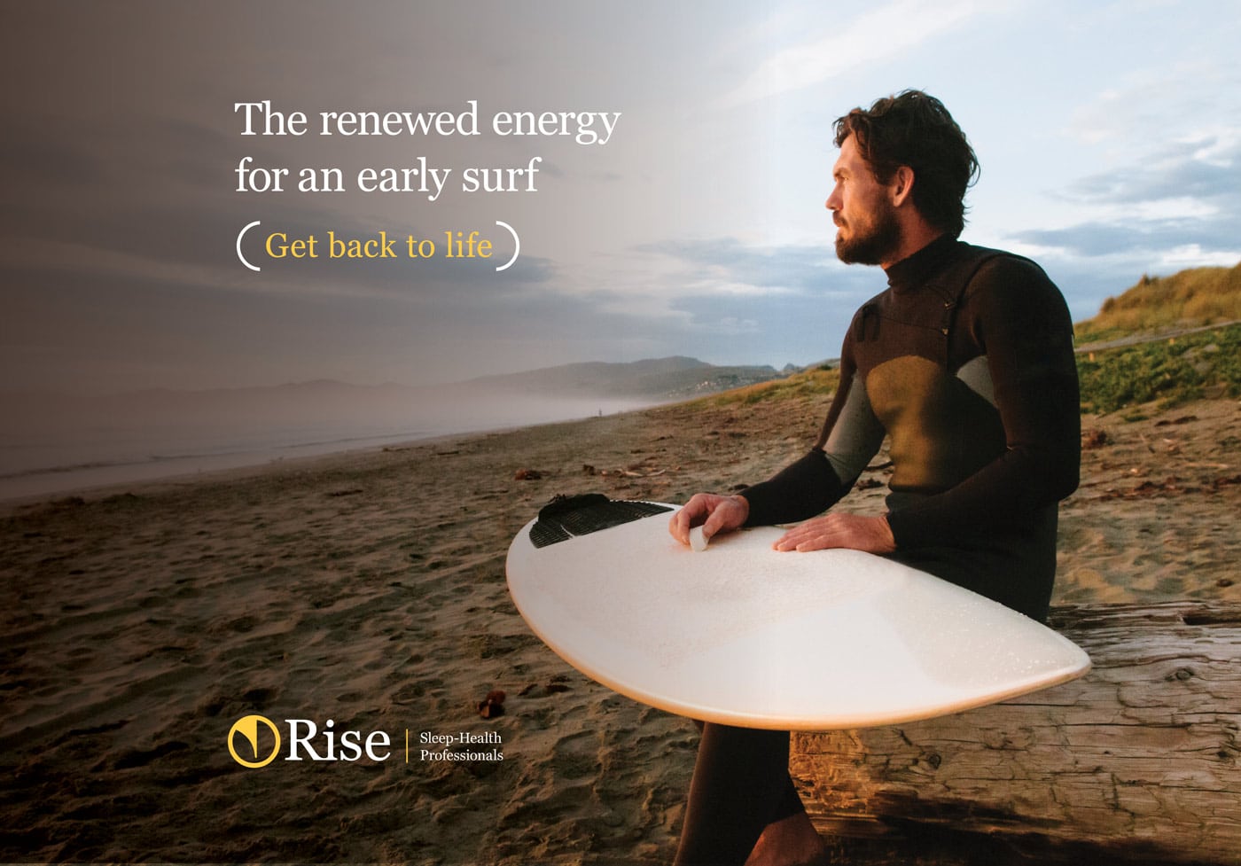
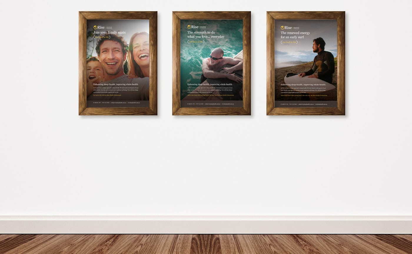
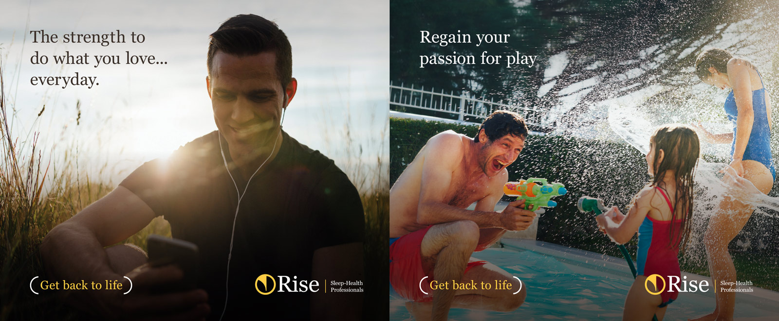
We switched the focus to helping the whole health of real sufferer, outlining the positives and benefits of better sleep health. Reminding them of the energy once had, and with the help of the Rise team, the better life they can have again. Which leads us to the USP… Get back to life.

A new name and icon that inspires renewal
Sin created a new name for the brand to reinforce the new position of getting back to life. Most competitors in the industry used the word Sleep in their title (go figure!) and variations of medical terminology in an attempt to convince people of their scientific and medical approach. Logos with heartbeats were a common occurrence.
Rise’s previous name was enough to put you to sleep and had no uniqueness or retention. Plus it was a mouthful! Sin chose the name Rise as a combination of Revive and Vitality. It’s one of those words that sounds like a real word (“I’ve got so much Rise again”) but isn’t really. It’s made up. And in those simple 4 letters, there’s a whole brand story to be told.
The icon was kept simple; a stylised V representing a seed pod and new life. It’s a cross between a safe medical logo and a flowery health food chain. Rise had to be seen as trustworthy and serious, but with a gentle human touch.
The benefits of a positive focus
Focusing on the achievement and positive outcomes of a patient was vital to the strategy. A huge problem with treating sleep conditions is getting a sufferer to take the first step and ask for help. A lot of this is down to fear. What they usually see are images of CPAP sleep masks, machines and angry partners. Our switch in focus helps put patients at ease from day one, with inspiring imagery and a benefit driven positive tone of voice.
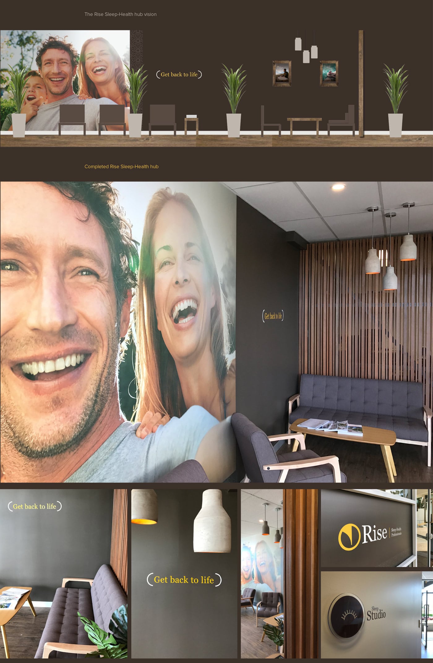
Space designed with peace in mind
Visiting a sleep clinic was another road block for sleep disorder patients. The cold and sterile surroundings of a medical centre creates more fear and anxiety, this was definitely the wrong approach. Designing the Rise environments was key, a warm and welcoming space was needed to put patients at ease during their visits. This was accomplished by the use a warm colour palette, soft lighting, a strong emphasis on timber and calming textures and positive imagery.
Steering away from the clinical palette of white and blue and strong fluorescent lighting, we avoided what was creating discomfort for patients, another health service housed in a cold, unwelcoming clinic…The sleep-health hub was born.
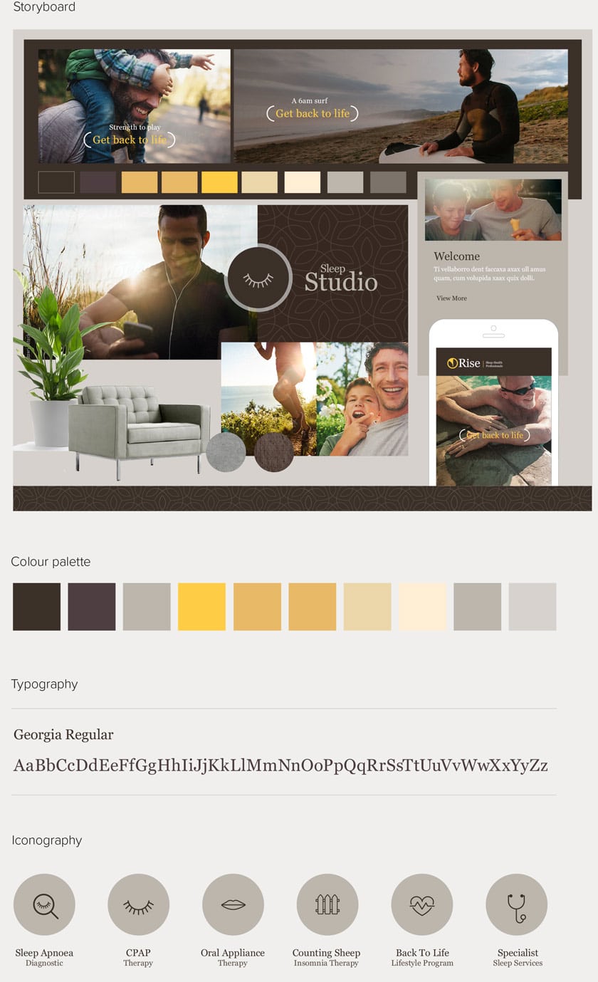
Brand development
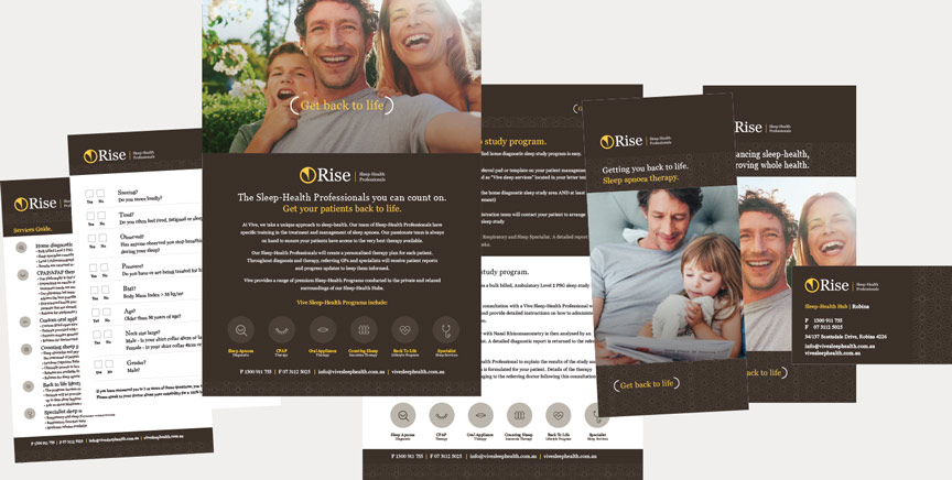
Print collateral
Digital presence