BEM Brand & Website Design
A fresh design for the experts in tunnel engineering
The construction industry is a tough place, and the companies that build tunnels and mines get to play with the biggest machines. A weak trendy brand would not cut it amongst the big end of town that dominates here.
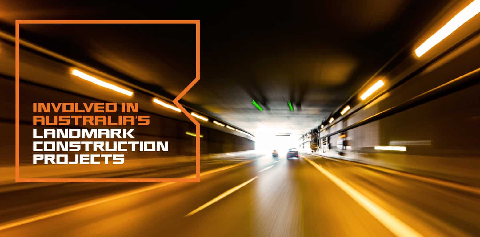
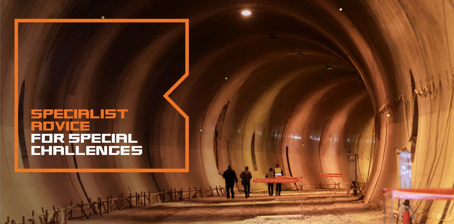
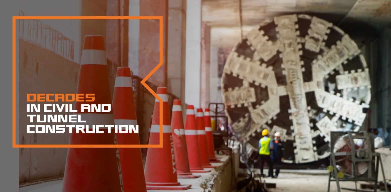
Sin’s brand for BEM is simple and bold - a stylised B like a block of concrete with a cut out wedge, a powerful orange palette and a no-nonsense solid design aesthetic that shows BEM means business.
A rock solid font
Sin created a customised typeface for BEM as tough as the projects they work on. Based on the square block and diagonal wedge of the logo, each character looks like it was hewn from rock and engineered to stand the test of time.


