Palm Lake Resort Bargara
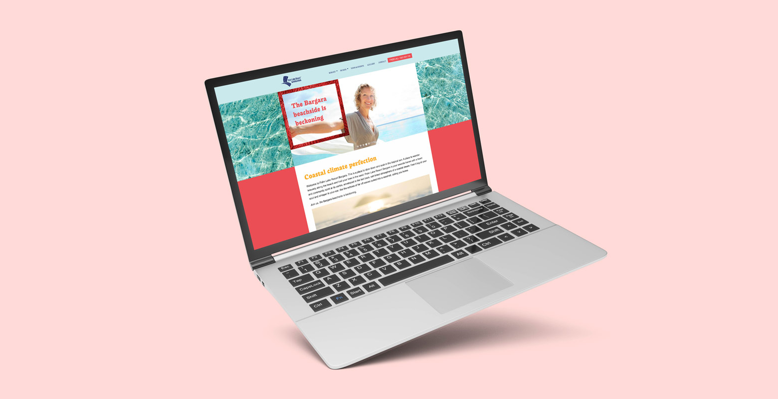
Coastal climate perfection
Palm Lake Resort Bargara was an existing resort halfway through selling that needed a refresh and a new marketing approach. PLR Bargara’s new brand captured the essence of the sub-tropical location and beachside vibe without over-promising.
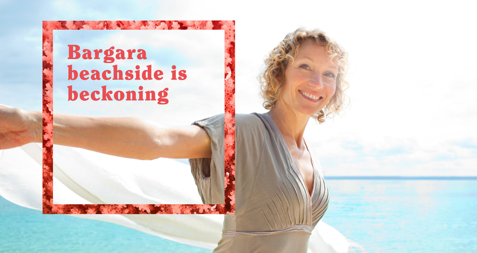
Bargara is a well known tourist destination for over 50s but does not command the prices of the southern PLR communities nearer Brisbane, so the brand was deliberately designed to echo a seaside tourist destination look. It is bright, vibrant and playful, infused with joy.
Palm Lake Resort Bargara is a place to slow down and soak in the tropical sun. A place to wander leisurely along the beach and trail your toes in the sand.
Brand Story Board
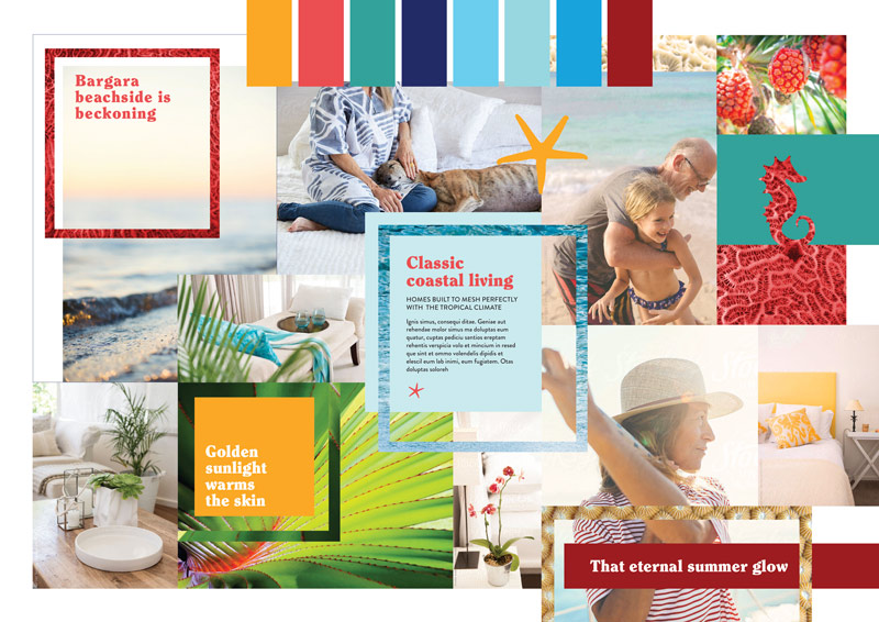
Beckoning beachside - our brand story.
The new brand look is bright and vibrant infused with joy and the whisper of perfect summer moments. Tapping into the surrounding environment brings an authenticity to the brand in the form of natural elements such as the Pandanus trees along the boardwalk, the warm tropical waters, the soft sand and the coral of the nearby reef.
These elements are paired with a strong summer colour palette that sets the mood and frames the imagery.
The photography styling is deliberately emotive and focuses on moments captured in time that embody the perfect coastal lifestyle. Tightly cropped images of beautiful home furnishings also tease at spacious light filled havens to call home.
Understanding the location is the key
To attract the right audience, a brand is not so much about the collateral and elements, but about capturing the promise and essence of the product.
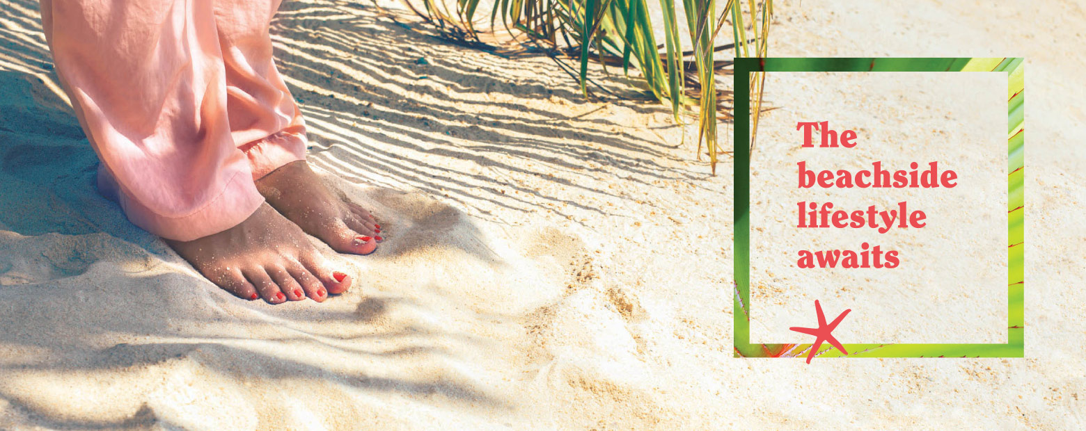
Bargara is a holiday location, but not a sophisticated destination. It is more caravans than cafés, more thongs than sandals, fish and chips wrapped in paper rather than grilled coral trout and white wine. It is where the average Aussie goes for a budget beachside holiday. It has been bypassed (for now) by luxury boutiques, or million dollar beach homes. This gave Bargara its own flavour, and it attracted a certain audience.
Our role was to hold back on the natural tendency for every coastal property marketing campaign to oversell the sophisticated beachside lifestyle.
We achieved this by staying true to Bargara’s roots. A bright holiday colour palette, some fun iconography, people dressed down for the summer and a definite focus on the natural attractions. Like island life, the life of Bargara is strongly controlled by nature’s clock of sun, wind and tides.
This brand was about an unspoilt coastal village retirement lifestyle.
Typography, iconography & graphic elements
Bargara is famous for its nature, but instead of cliched images of giant reefs and turtles, which was the default look for any local advertising, we chose macro patterns of textural organic elements. Pattern on pattern layering in colourful frames created a unique and playful expression.
The use of Clearface as the bold headline font was deliberate to echo the 70s and 80s Australian beachside holidays that our target audience would have experienced. Frames and blocks of colour provide a structured container for these elements of fun to sit within while allowing layers of the brand to be brought in with close up photography of shells, water, leaves and coral nestled inside the frames.
Photography styling
In keeping with its fun, holiday location, we chose lots of bright sunkissed images to showcase the gorgeous tropical climate with bright bold colours to convey warmth and the relaxed coastal lifestyle. Close-ups of moments create a sense that there is all the time in the world to fully enjoy and appreciate life.


Successfully sold out
Within 12 months of the new Bargara brand being implemented the remaining 80 homes were sold.

