Chevron Renaissance.
Sin were approached by Chevron Renaissance Shopping Centre in 2014 to revitalise their brand and increase visitation. Where we took them however is not where they expected. The existing brand was cold and stale with the feel of a typical suburban shopping centre. Chevron Renaissance was always aware of the tourist traffic, but they were missing a whole demographic right on their doorstep… the locals.
Our research revealed a large proportion of the local demographic in and around Surfers Paradise were 18-35 year olds. This demographic had lots of dull shopping centres around them but nowhere cool to eat, drink and shop.
With Chevron Renaissance and rest of Surfers catering mainly for tourists, the younger locals where travelling to Nobby Beach and Burleigh Heads and beyond to seek out bespoke shopping, cool cafes and bars.
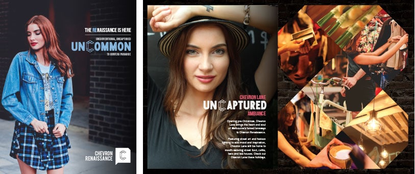
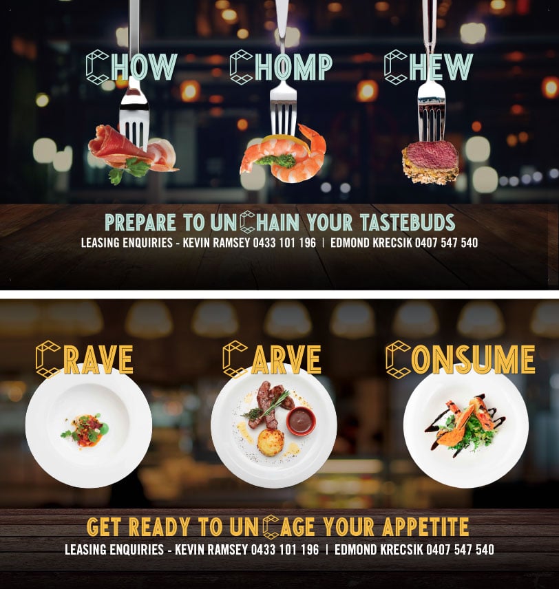
We wanted to make Surfers cool again, with a much younger brand that carried a more Melbourne laneway feel. The brand would use an edgier tone of voice and bespoke photography, a complete 180 from where they were. The results were beyond expectation as Chevron underwent a true renaissance.
Industry
Logo Before
Logo After
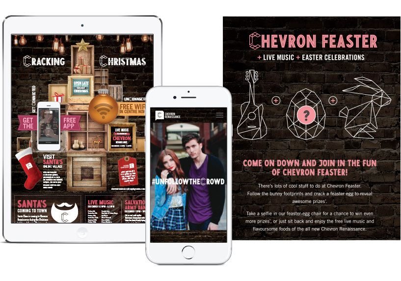
With the new brand complete, a bespoke photoshoot took place in the centre. The brand was then rolled out across all mediums from web, print, press, signage and social media. It gave the centre the boost it needed and started to attract a younger crowd as well as businesses it had never been able to attract before such as cool cafes and street food style vendors.
The re-brand was a major success. With the client excited with the new direction, many fun and quirky campaigns encompassing the new brand have since run their course and proved successful.
VERBAL LANGUAGE

Re-launch Brochure
Restaurant Lease Hoardings
Seasonal Campaigns
