Building an emotional connection
When launching a master planned community in the iconic seaside location of Lennox Head, we knew the target audience would not be fooled by the usual real estate promises. The estate needed an authentic brand as cool as the location itself. The brand needed to feed off the emotion people feel when visiting Lennox, and create longing for the area and the brand itself. The desire to live the Lennox lifestyle everyday was the emotional trigger, and the audience would be reminded of this at every opportunity. A surf before work, a morning stroll along the beach for coffee and truly endless summers… That’s so Lennox’.
Industry
What we did
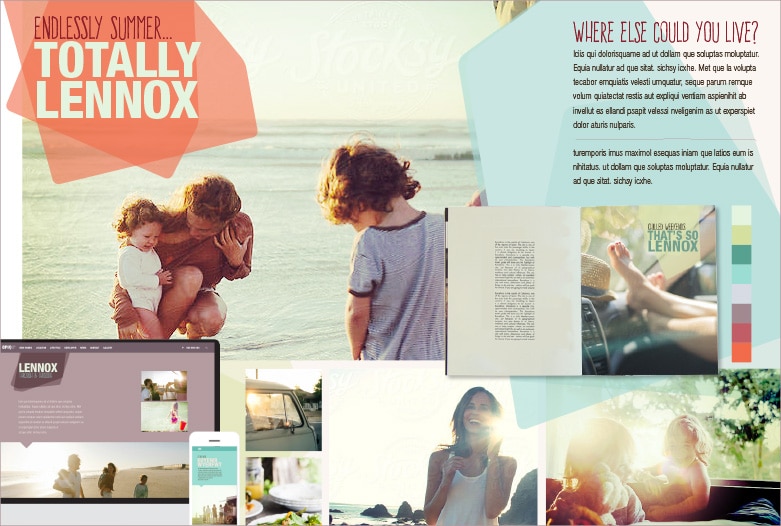
The name says it all
![]()
When developing the name, we wanted a something that evoked both spirit and location. It also needed to avoid the cliches of ocean and beach themed names. We need a name as legendary as the town, one that was playful, a little cheeky and highly memorable…
In essence, it had to be Epiq.

Photography
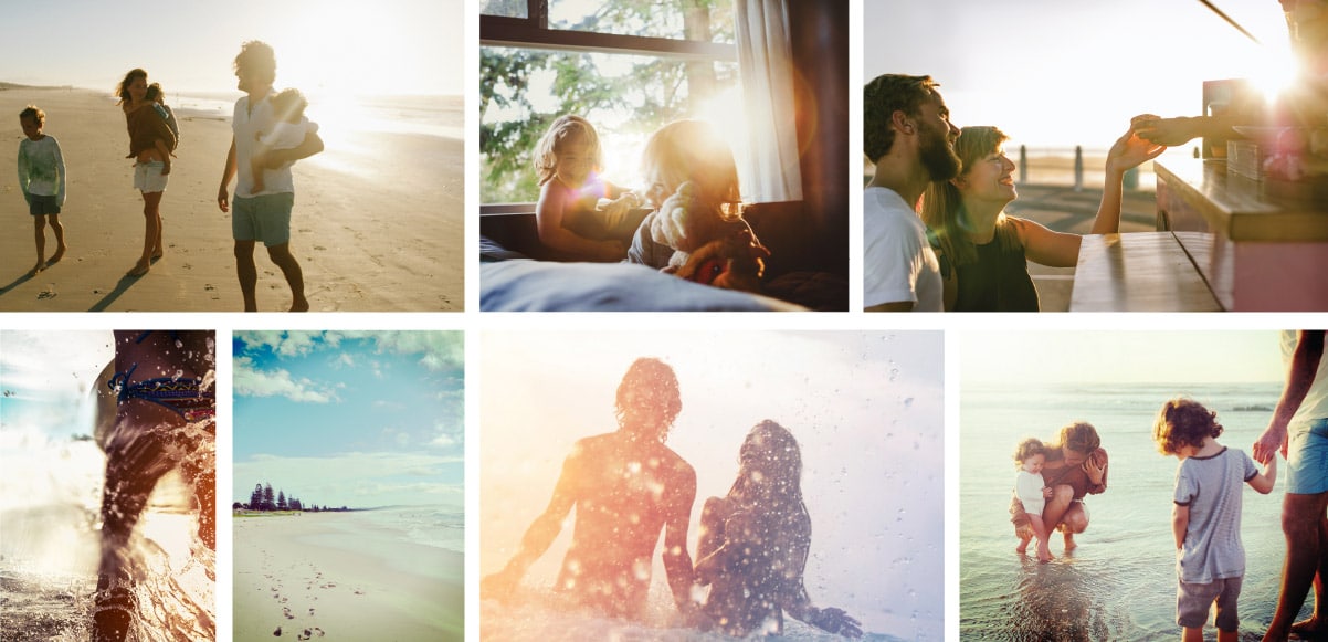
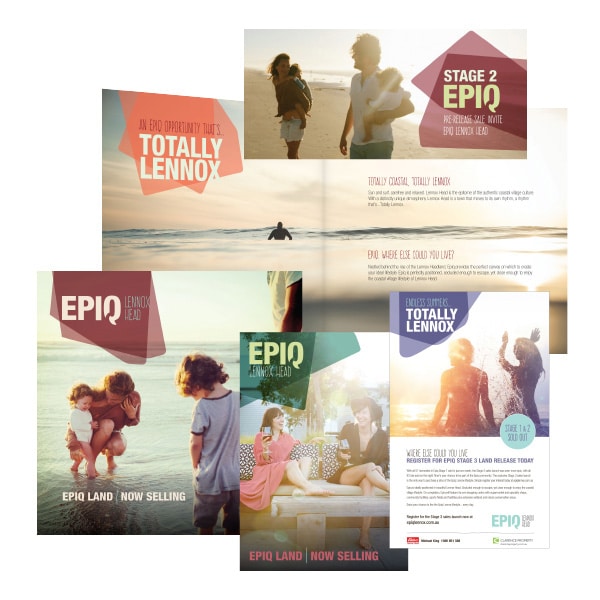
With light as our hero, and a subtle hint of retro, Epiq’s photography highlights the ambiance of coastal living. The beach, the ocean, a morning coffee in a sun-bleached cafe, a classic surfboard filled car driving over the headland. Images that are… So Lennox.
A language that’s...
![]()
When developing the verbal language for Epiq, we wanted to use an approach that was worlds apart from the usual tone applied to residential developments. A language that described the Lennox way of life, the mood, the feeling you get only by being there. Coupled with the playful, sun-drenched photography styling, we created an emotionally driven brand that’s, relaxed, authentic and totally Lennox.
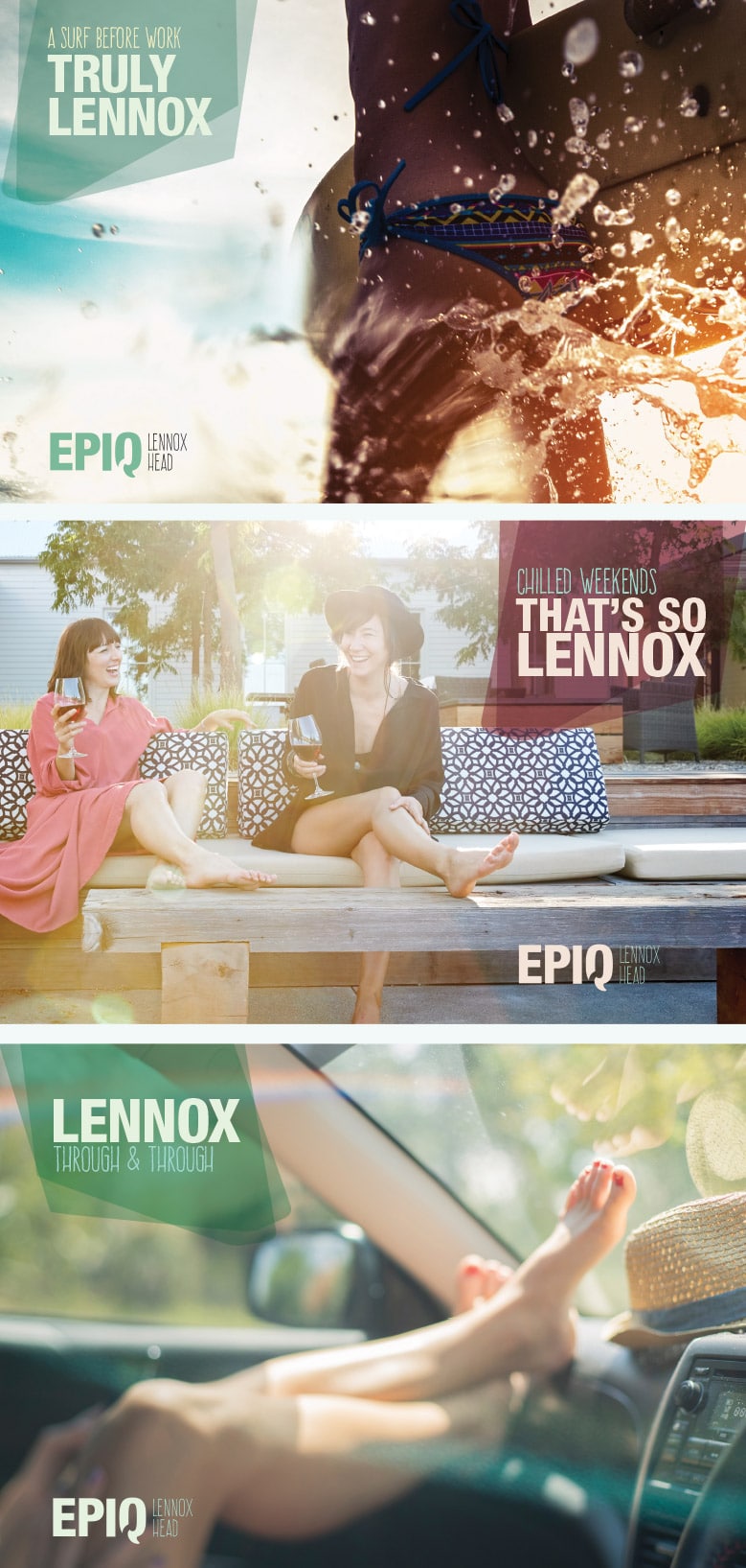

A challenge to the audience. It hints of something special that cannot be replicated elsewhere. A question to the answer of Totally Lennox, deliberately asking ‘could’ not ‘would’ because the audience is driven by something deeper. In the same way an office cubicle will kill a Gen Y worker, this audience cannot live in a typical estate.
Brand development
Storyboard
Colour palette
The carefully selected colour palette tells the story of the easy going beach lifestyle.
Soft, cool pastels portray cooling summer breezes. Shades of mauves and burnt oranges provide a warm, summer glow to the palette and subtle greens provide the backdrop and beauty of the surrounding nature reserves.

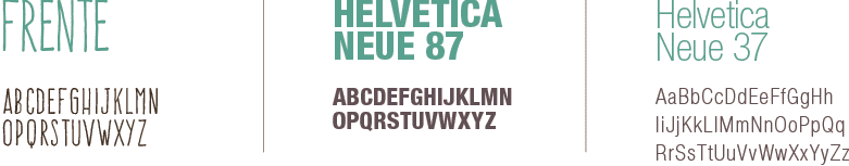
Typography
Typography was inspired by Lennox surf culture. We chose the handwritten font Frente for its ability to deliver a personal, relaxed style. It was also the perfect partner for the strong headline, and clean body copy fonts.

An epiq vision
To truly connect with potential buyers, we produced a video that captures the stunning Lennox Head location and the spirit of the tight-knit coastal community, the key ingredients that make Epiq so Epiq.
Epiq results
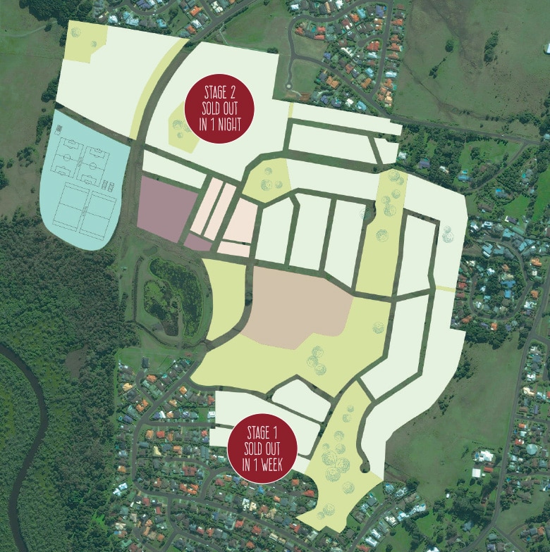
From day one, Epiq proved incredibly popular with home buyers. The number of expressions of interest via the website far exceeded the homesites available in stage one. The developer had no choice but to hold an invitation only, one-night sales event. All 51 homesites released on the night were sold in just one week.
With interest continuing to grow, a sales event for stage two was also held with even more epic results. All 82 homesites sold on the night.