Overview
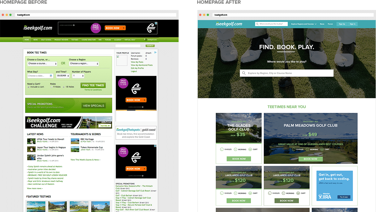
Iseekgolf.com is the market-leading golf course booking service and information provider for golf enthusiasts. Users come to iseekgolf.com to discover golf regions and courses, read the latest golf news, browse product reviews, book a round of golf or to contribute to the forums. Although the site has a well established, loyal user base, the website was starting to look dated and left some users feeling frustrated due to usability issues. To rectify this, iseekgolf.com approached Sin Design to help them create a modern brand identity and improve the user experience.
Industry
What we did

Approach
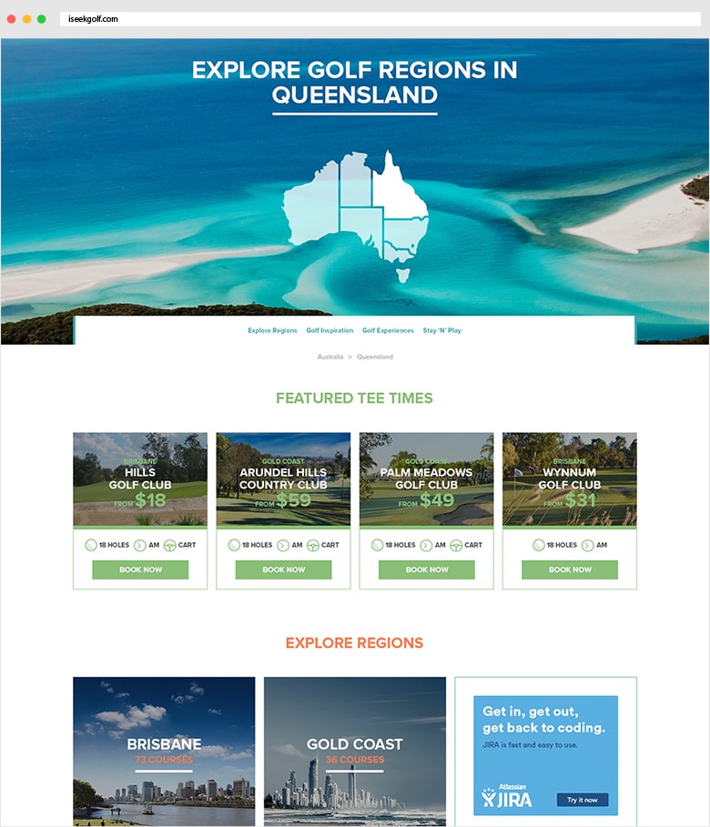
Firstly, Sin Design developed a strategy to enhance user engagement and increase return visits. Part of this strategy involved the creation of meaningful content consisting of expert course reviews, articles about golf regions and incorporation of community-sourced content. Site navigation and architecture was also reinvented to encourage exploration of courses and regions. To refresh the visual appeal of the site, a clean, modern style was integrated consistently across the interface.
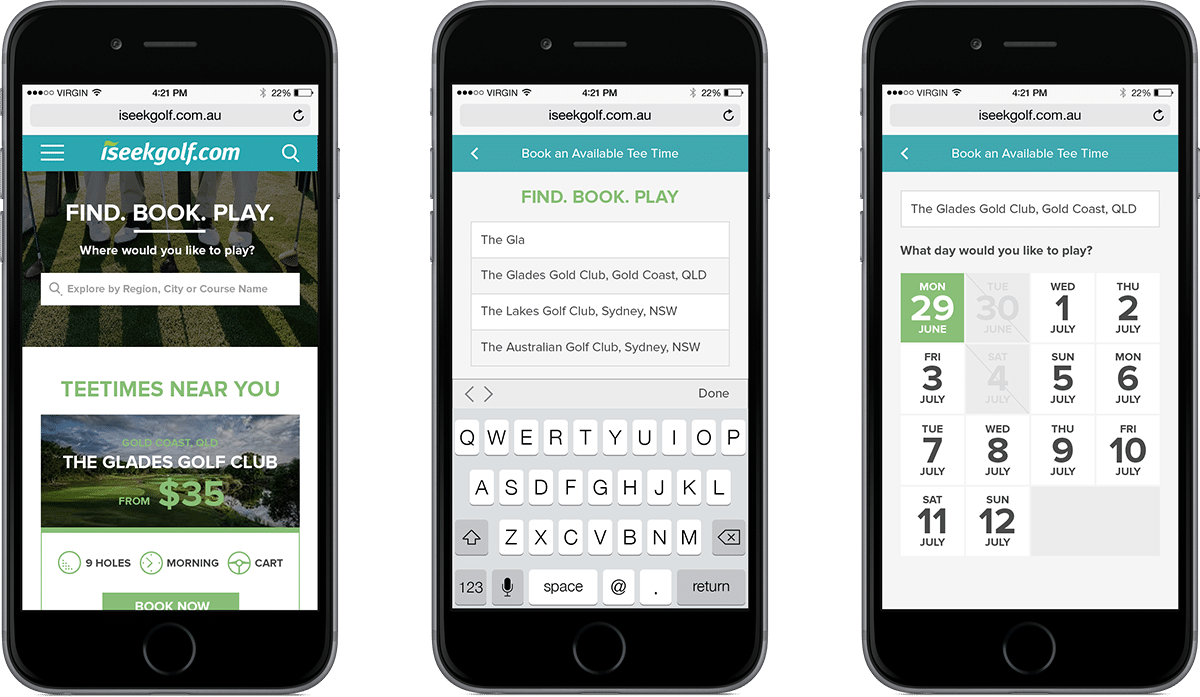
Sin Design took a data-driven approach to the site redesign. Through analytical research, it was evident that iseekgolf.com was experiencing a rise in user visits on mobile devices. To ensure the experience of these users was seamless and enjoyable, Sin Design approached the redesign from a mobile first perspective. The result is an intuitive and consistent user experience across mobile, tablet and desktop devices.
From initial research, it was evident that the booking flow was a high priority for both the users and business. Low-fidelity prototypes were quickly designed and tested to try different ideas. After several iterations of testing and feedback, the user flow was refined to a stage where Sin Design could create hi-fidelity designs.
This project was highly collaborative, with the client utilizing an in-house team for development. We worked very closely throughout design and development iterations. Close communication ensured a seamless workflow between the client, Sin Design, and the development team.

Outcomes
Initial user feedback has been great, with visitors praising the new visual style and ease of use and navigation. Additionally, the client has benefitted from a modular website design, enabling them to update and add to the site without losing the visual style.
Visit the website


