
Provista - Rebrand
A new name and brand enhances the flavour.
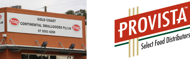
Gold Coast Continental Smallgoods wanted to expand their business and came to Sin to help. We quickly realised that any marketing spend was going to have little effect with their current brand positioning.
The highly competitive food distribution market was controlled by some major national providers, with clinical names and logistics-inspired brands. The answer was too look in the other direction and create a brand with built-in European heritage.
Industry

A smaller mouthful and all the class of a European label.
To grow Gold Coast Continental Smallgoods needed to be seen as larger, more credible providers to match the big distributors. The first issue was their name. They were no longer just local to the Gold Coast, and their product range had expanded far beyond smallgoods, leaving many customers to only order smallgoods from them and other foods from other companies. They were not only missing out on increasing the spend of their existing customers, but large clients, such as hotels, hospitals, theme parks and conventions centers, still saw them as too small to cater for the demand.
As part of a Brand Strategy, Sin created the new name Provista (meaning supply in Italian) to suggest European-style fine foods. The challenge for the new logo was to convey the quality feel of an exclusive label, yet also position Provista as a capable bulk food distributor. The classic design of the identity still promotes food strongly even when all reference to food is removed.


Changing the conversation to avoid price wars
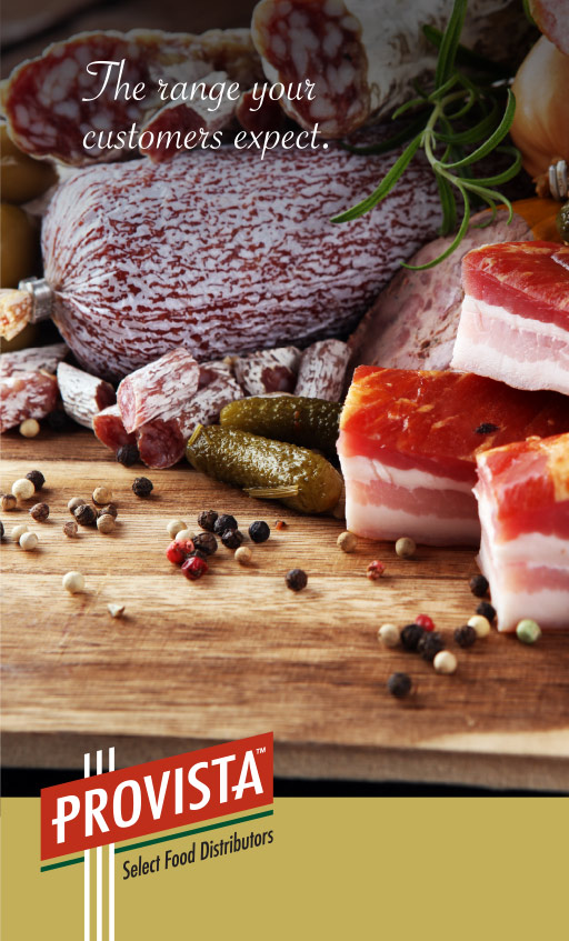
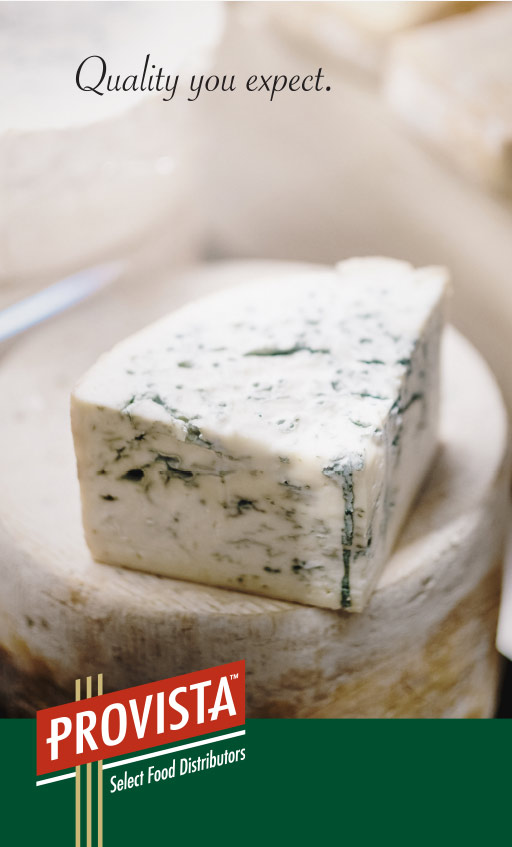
A new positioning statement for Provista makes people think before buying the cheaper alternatives.
In an industry with few fixed contracts, many food outlets shop around on price on weekly basis from a group of providers. Rather than constantly adjust pricing to win the business each week, we changed the conversation to the quality of the final dishes, and what their own customers will be eating, and judging.
By using images of the chefs themselves we deliver a message that quality ingredients are critical to their reputation.
The new slogan suggests that using Provista will enhance their clients’ own final foodwares to their customers, effectively enhancing Provista’s own product and business (and therefore highlighting the alternative – the false logic of saving a few dollars on cheaper ingredients if it results in poor final dishes and unhappy customers).
The slogan can subtly change to suit the audience


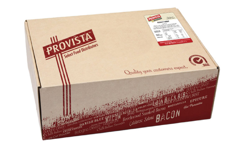
Spelling out the range
Sin created a dynamic and eye-catching pattern of food names supplied by Provista in typefaces that matched the feel of the food. Its use constantly reinforces the diverse range of offerings to the audience. Each time a customer receives a Provista delivery they are presented with a list of items they may not have known Provista stocks.

The wrong message
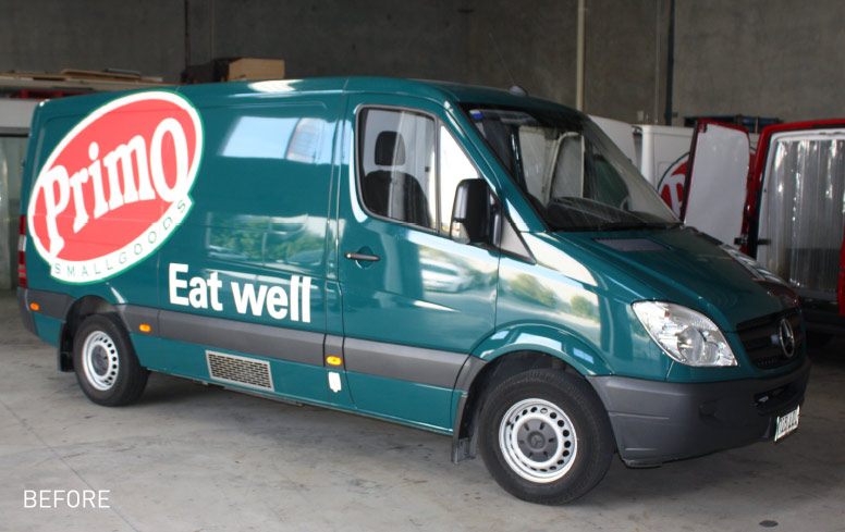
For many years, Gold Coast Continental Smallgoods had relied on the names of their biggest brands to gain marketshare and awareness. It was a strategy that required no cost, as their suppliers were happy to pay for signage and marketing to get more promotion. Primo even covered their whole van. But it left GCCS vulnerable if they ever lost their major product brands – nobody knew who they were! In fact many only remembered them as the brands they sold and even thought they were the product agents, not independent distributors. Plus it gave far too much leverage to the product brands when negotiating contracts and margins.
With a new name and strong identity, Sin helped redesign the vans and packaging to promote Provista.


Building a private label
A strong identity also gave Provista the opportunity to create their own private foods brand of white-labeled products under the Provista name.

