Palm Lake Care
A new age of care
Heading into a new age of care, Palm Lake Care approached Sin to help reposition the family owned company to portray their true values. We rethought the entire brand from their digital presence, advertising and print collateral to the communities themselves. The results were beyond expectations.
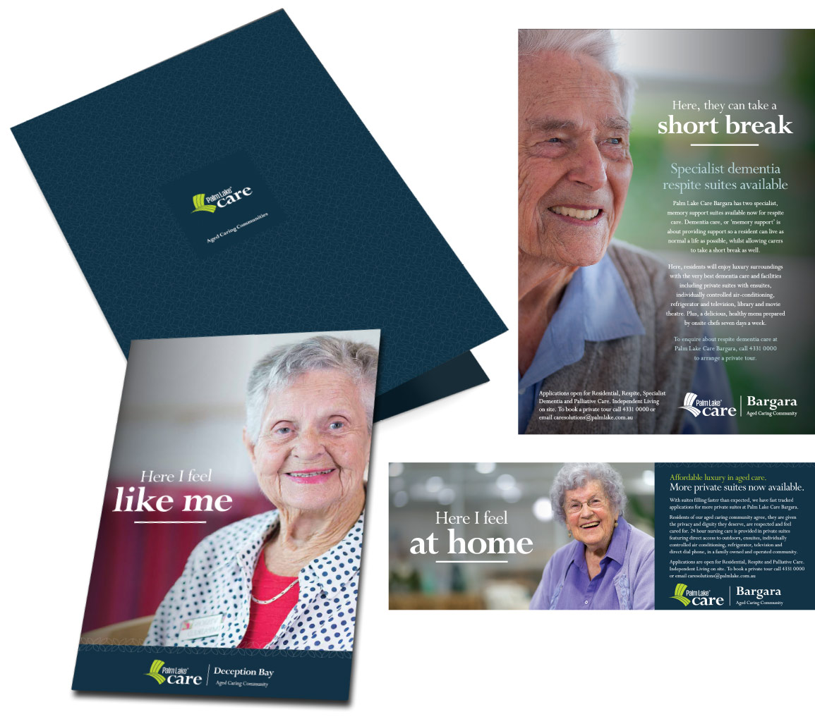
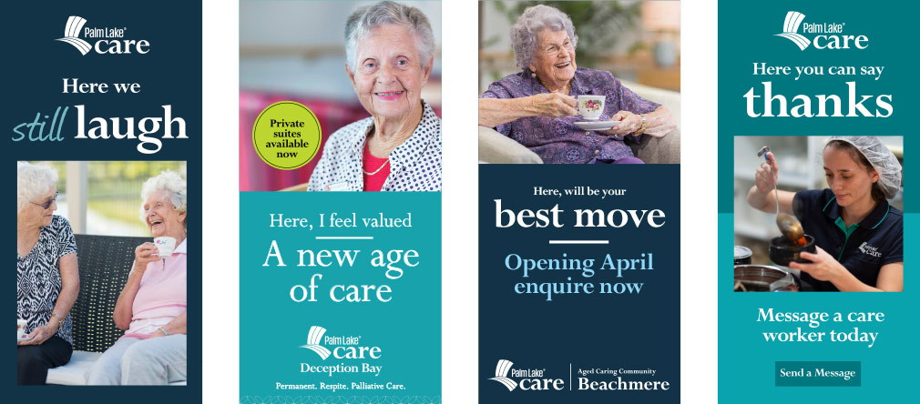
Humanising the brand: “It’s all about me.”
The new brand is all about me, and how PLC makes me feel.
By giving the residents a voice, it celebrated the individual, humanising PLC. It reinforced that every resident is an individual with hopes, dreams and concerns – they are more than a patient and the sum of their care needs.
Too many competitors focus on their own brand thinking their good name will get people across the line, by boasting how great they are and how much they care, to the point where it is no longer a differentiator and it just becomes white noise. For any large professional aged care organisation, delivery of quality care should be a given and is no longer a unique benefit.
This boast can also be viewed cynically with the current negative perceptions and media focus around organisations not delivering care. So instead of shouting ‘we care’ louder, let’s move the emphasis to the resident.
It is the benefit of the care, not the care feature itself. As per marketing 101; sell the benefit not the feature. Residents tell the Palm Lake Care story with short, memorable and emotive headlines that capture attention, where real narratives can be created through resident stories that inspire.
Logo Evolution.
Sin modified the existing logo to move away from an outdated perception that care needed to be shown as feminine to deliver a nurturing message. The pink handwriting, reminiscent of daycare or cheap retail, was replaced with a stronger lower case word to convey a professional and stable organisation.
Before
After
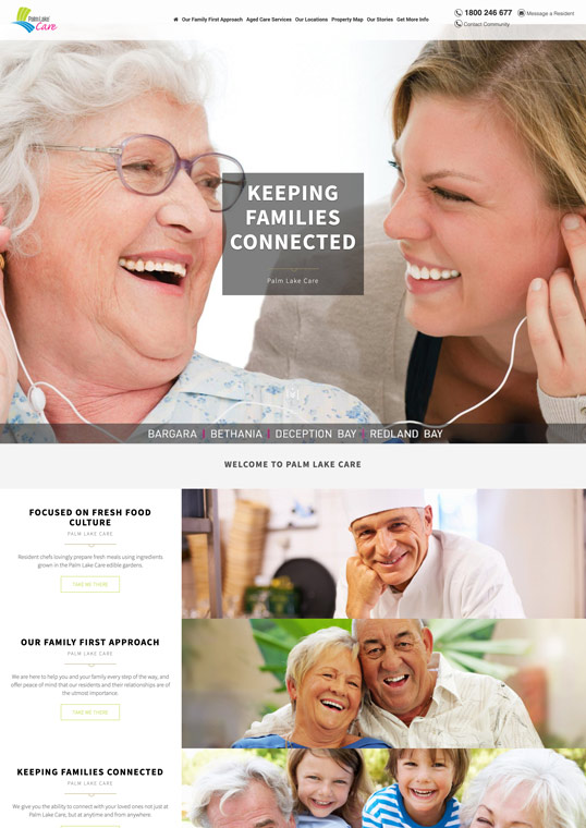
A whole new language.
Sin derived a whole new language and tone of voice for the rebrand. Again, it would be a resident focused approach.
The aim was to be authentic and stay clear of the condescending tone of voice used by so many competitors. It is all about them, the resident, after all, isn’t that what aged care should be about.
If the residents are happy, healthy and safe, it sends the right message, that Palm Lake Care is a great place to be.
So let’s tell their stories.

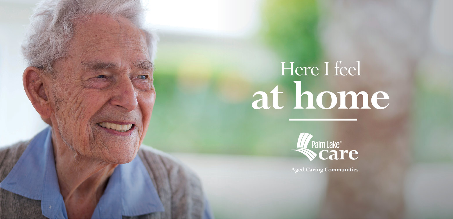
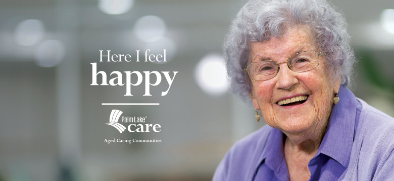
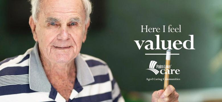
Photography. Keeping it real.
The new photography uses the actual residents of Palm Lake Caring Communities. The style and overall feel of the photography is relaxed, featuring residents at ease in their surroundings.
These are real people with real emotions. Dignified, happy, reassured, confident. They feel secure and happy, they have good food and help at hand when needed. The residents were more than willing to get involved with the photography and delighted with the results.
The genuine nature of the photography shines through, there are no cliché, aged care images here.


Print Collateral.
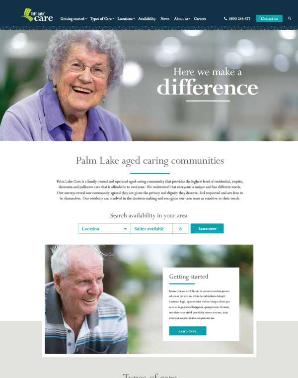
Digital Presence.
Before
After

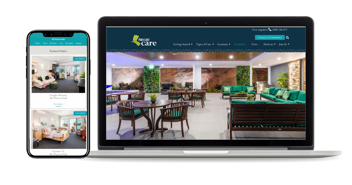
Digital Ads
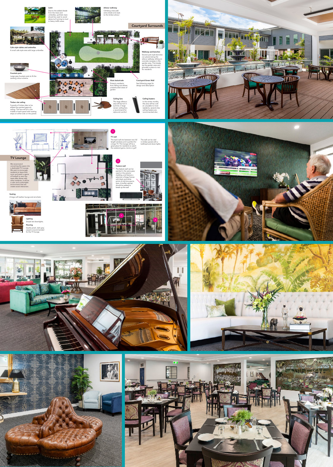
Creating the communities.
Sin works closely with Palm Lake Care and interior designers to create specifically themed Communities. Rooms, dining areas, lounges and wayfinding signage, even landscaping and outdoor areas are carefully thought out to create a warm nurturing community with a distinct feel.
Courtyard and TV Lounge Theme concepts, Mt Warren Park
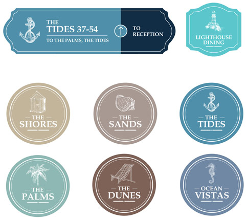
Finding the way.
The themes of each community is carried right through, even to how you find your way around. With many signs needed throughout each community, generic signage would be cold and clinical. Sin takes great care in designing wayfinding signs. The inclusion of bespoke visuals and colour codes for each neighbourhood helps residents and visitors find their way easily.
Neighbourhood wayfinding signage Mt Warren Park Colonial theme.
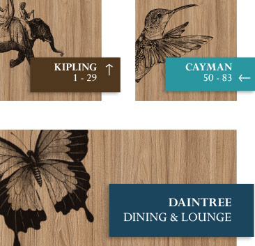
Neighbourhood wayfinding signage Beachmere Hamptons Coastal theme.