South Beach
Telling the story of living a beachside life
The new masterplanned community, South Beach, needed a brand to position it as the epitome of living a beachside lifestyle everyday. Located on the coast at Elliott Heads in the Bundaberg region, South Beach is the first masterplanned development of its kind to call the area home.
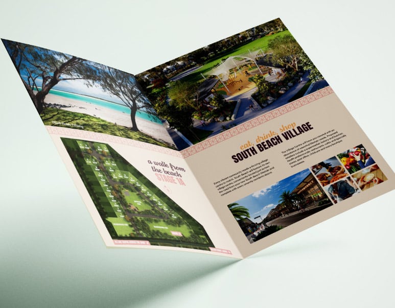
Sin created a brand that highlighted the dream of being able to walk to the beach from your home. South Beach is your coastal haven to call home. Somewhere that is affordable to live, where work and raising a family is relaxed and easy when living in such a coveted location as South Beach.
Industry
Images used are for inspiration purposes only and do not depict the final product. Images are copyright to individual image owners.
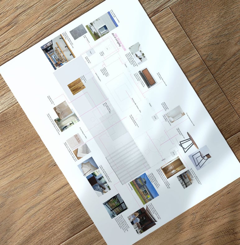
Storyboard
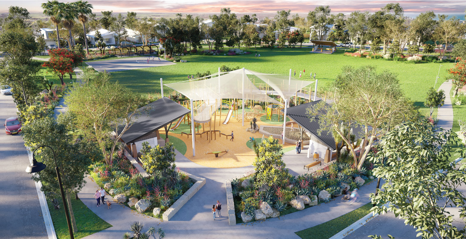
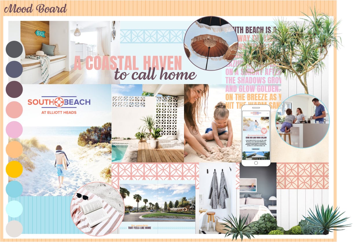
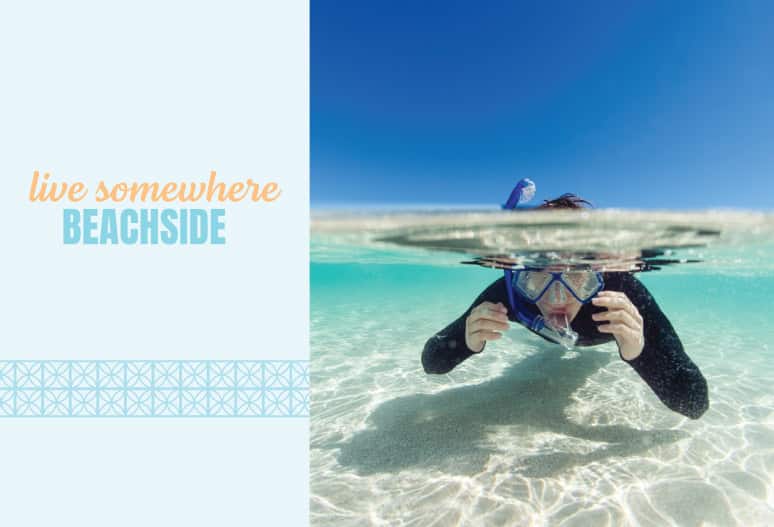
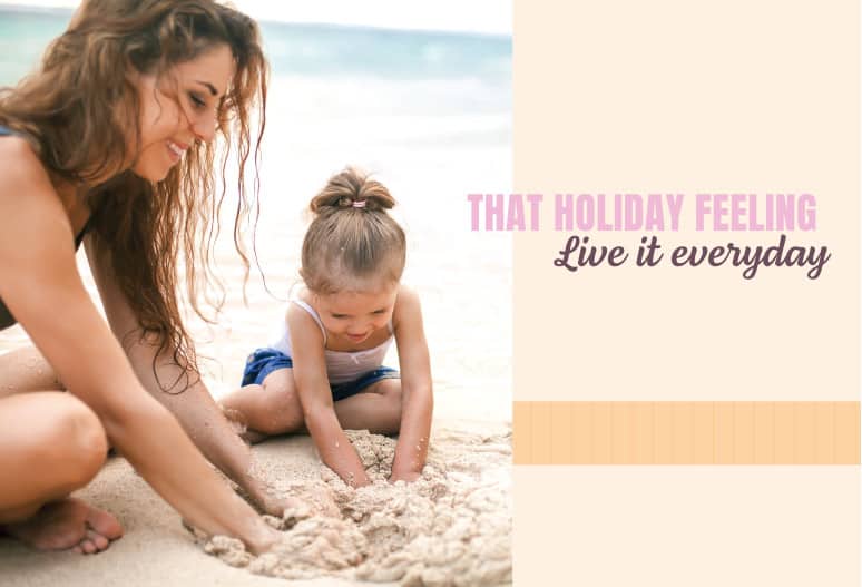
The mood crafted for South Beach is one of a relaxed beachside lifestyle. Where the sun paints everything golden and you can finish up work for the day and wander down to the beach for an afternoon swim. It’s a place to create your ideal coastal lifestyle, and feel like you can live on holidays everyday. Warm welcoming beachy colours mix together with laid back typography to create a modern yet relaxed look. Patterns mimicking the stripes of weatherboard and breezeblocks are a nod to the style of the built environment that will be woven through the estate along with a beach landscaping palette of pandanus trees, agaves and succulents. Photography of airy home interiors and sunkissed beach scenes paint the picture for a South Beach lifestyle.

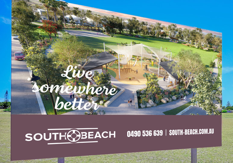
Live somewhere better - the brand story
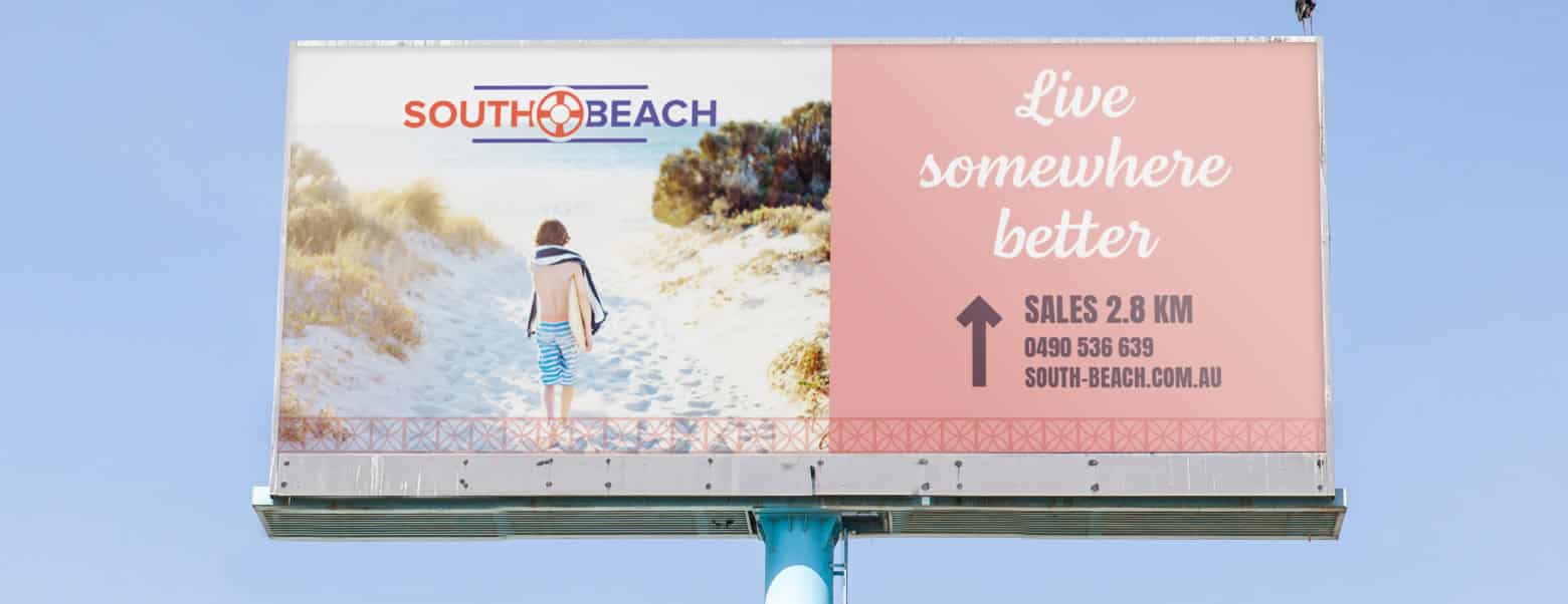
With multiple competing beachside developments more advanced than South Beach in close proximity, we needed a different promise to make people wait for South Beach. Live somewhere better is exactly that, a promise that life is not just about the home but the location. In this case it is all about the masterplanned community and facilities – a feature no other smaller subdivision could boast.
Complemented with washed out beach-focused imagery and family-friendly beach homes, we dare you to think about your current way of life, and swap it for something that makes you happier. South Beach is unashamedly proud in saying that nowhere else matches up.
Identity Design
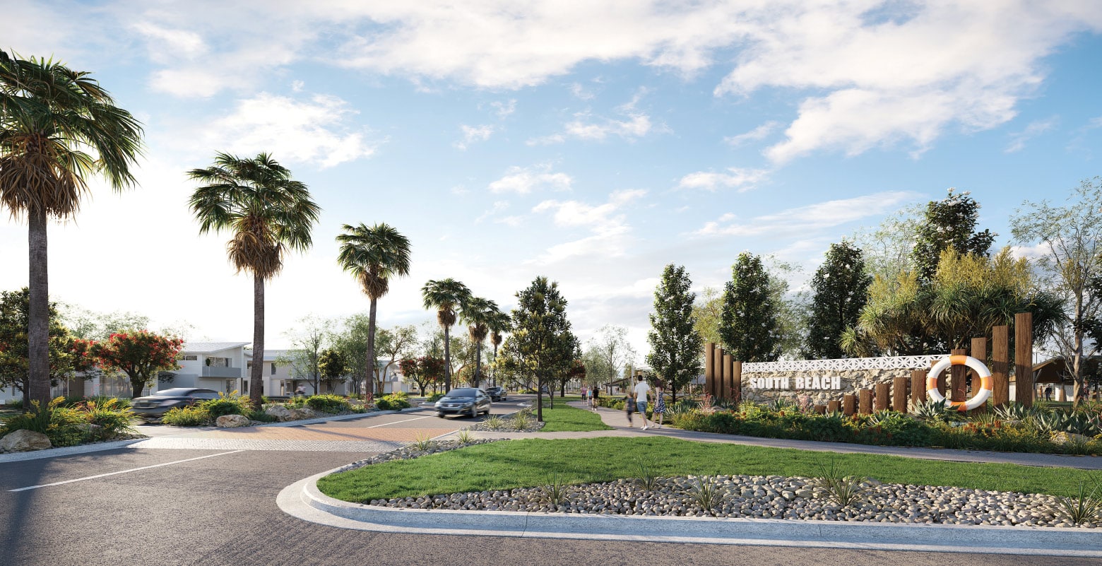
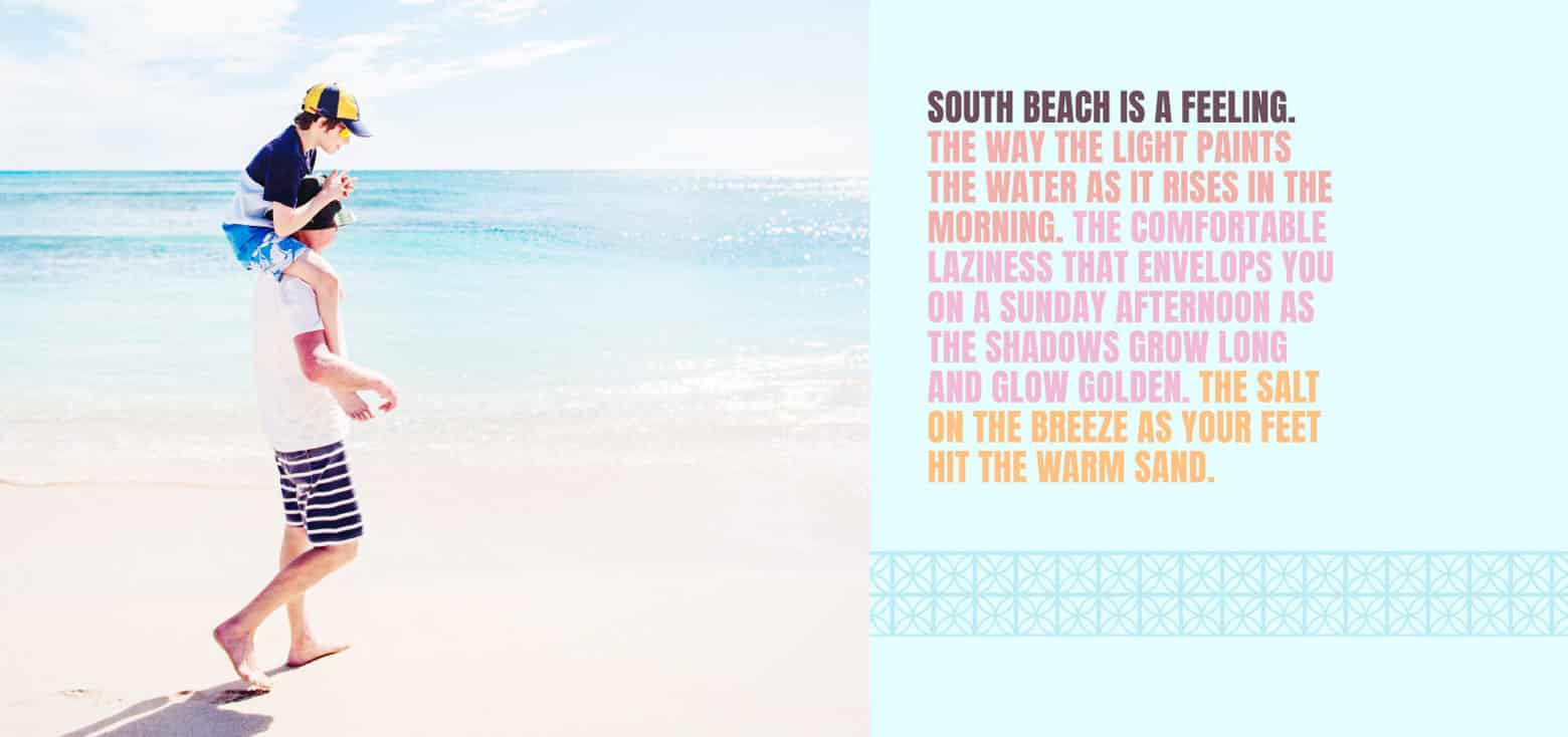
Inspired by the beach culture of its namesake, the South Beach neighbourhood of Miami, the identity design for South Beach at Elliott Heads uses strong bold typography and colours to evoke the fun holiday vibes of the area. The life saver in the middle of the identity pays homage to the brightly painted timber lifeguard huts that are dotted along the beaches of Miami.
Typography, colour palette and graphic elements
The typography is designed to encapsulate the feeling of South Beach: relaxed, coastal, carefree and fun. A strong blocky headline font is clear and bold and is softened by a flowing cursive font for subheadings.
The colour palette is inspired by the architectural hues of Venice Beach and Miami with soft pastels evoking sunsets and ice cream anchored by darker tones of charcoal and purple.
Patterns mimic the shapes of weatherboard and breezeblocks, two elements strongly featured within the beachside neighbourhoods that inspired South Beach.
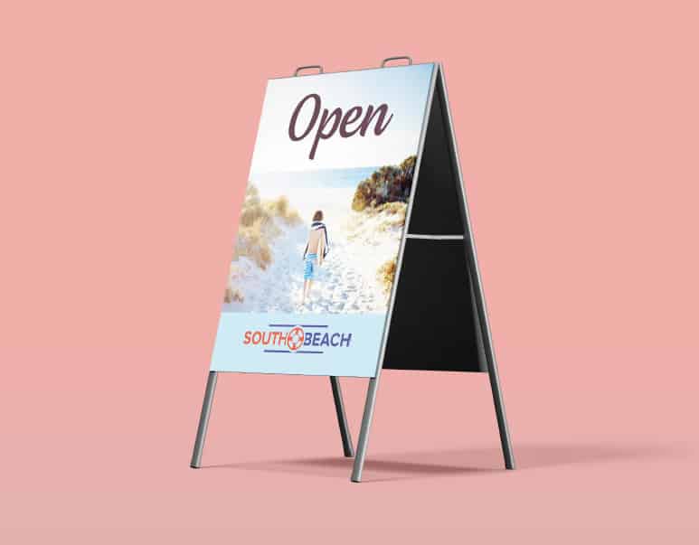
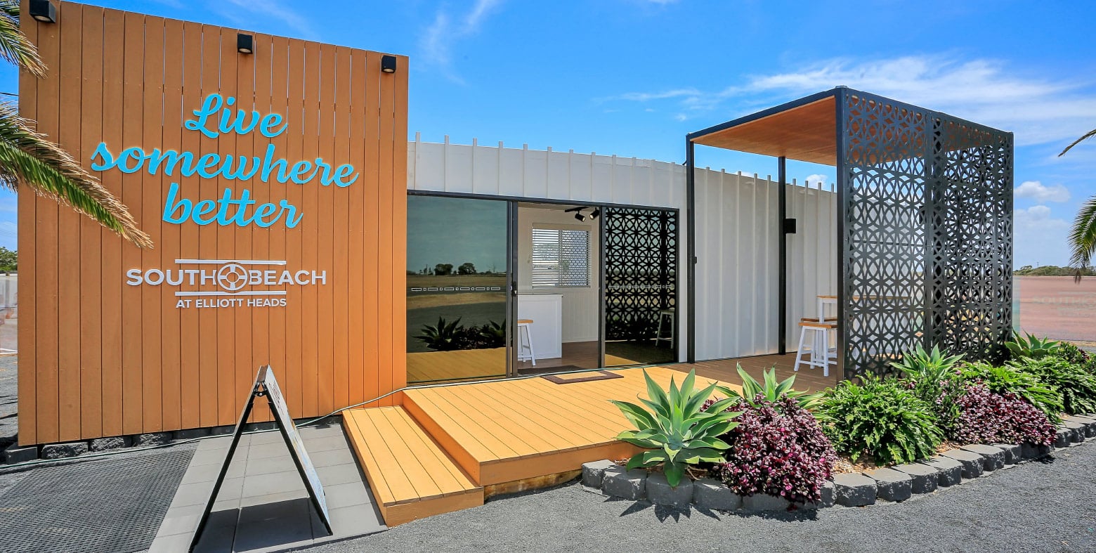
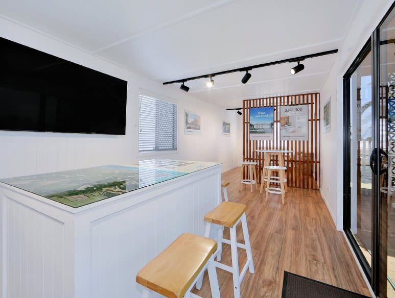
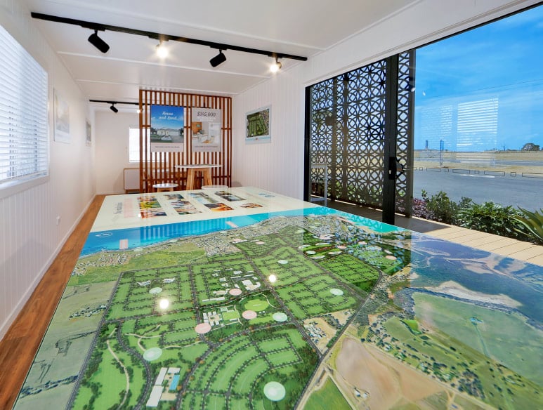
Sales Centre
Sin transformed a demountable site office into a sensational sales centre for South Beach, including the interior and exterior design, along with wall prints and a custom masterplan table.

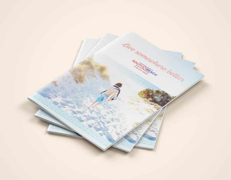
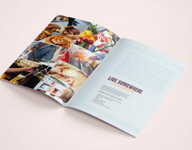
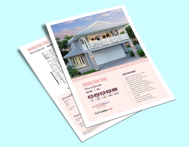
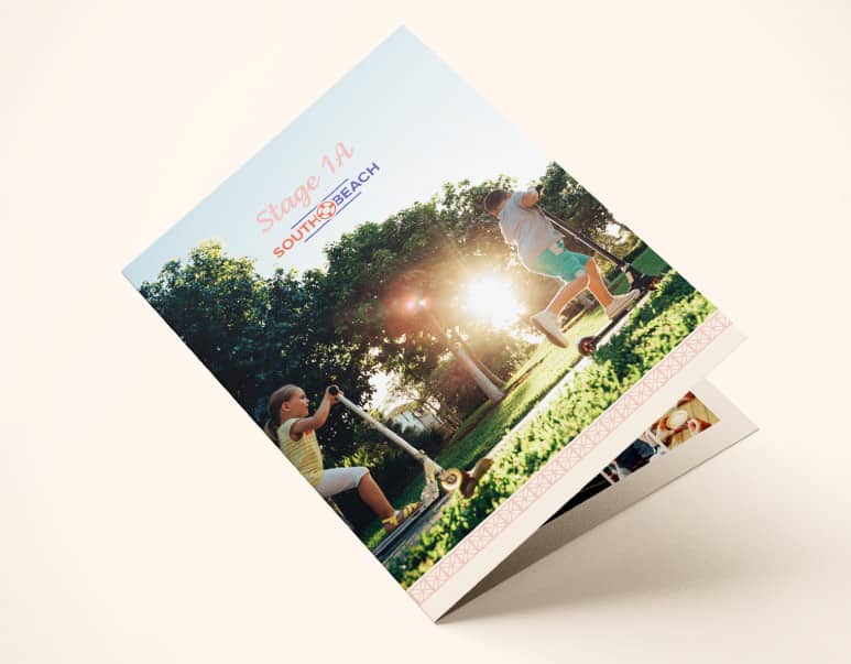
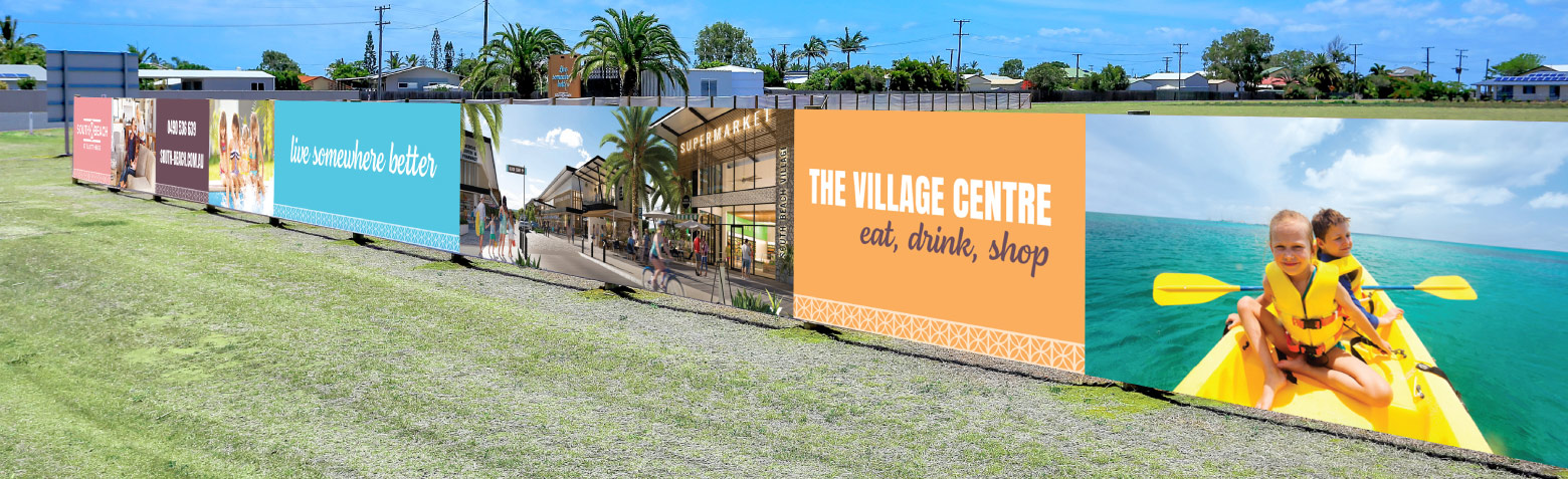
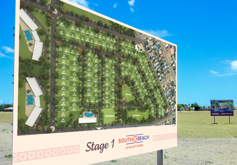
Brand collateral
Sin created every piece of collateral needed to launch South Beach into the market, from hoardings, billboards, road flags and signage, to brochures, stage plans, the website and custom tote bags to house the sales packs, as well as developing the look for the artist impressions and the masterplan.