The Quill Group - Rebrand
Drawing an unbroken line with the past.
When a company grows and evolves sometimes its branding must also reach new heights. Quill is a progressive accountancy group, firmly focused on the future and embracing online software to guide clients every step of the way. Its old feathered quill logo was more reminiscent of an outdated pen manufacturer than a 21st century financial group.
Sin created a new identity that still carried the equity forward, and a slick new position to inspire a whole new group of ambitious clientele.
Industry
What we did
New wings to fly
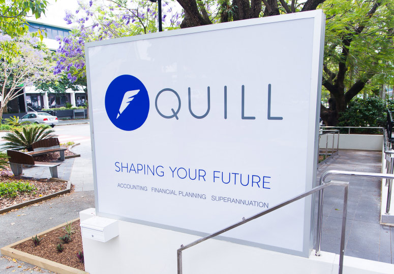
The old logo has lasted nearly two decades when Quill asked Sin for a re-brand. The name, and symbolism of the quill, was very important to retain, with good brand equity. It was based on the original bookkeepers; monks performing double entry bookkeeping using feathered quills. With accountancy and financial records online and cloudbased, the old logo and brand was at odds with the company’s new direction. Sin kept the heritage of the brand but modernised it to a contemporary, stylised icon that represents not only a quill, but lineage of the quill itself… the wings of a bird.
Shaping your future - making a difference with a new message
Since its humble beginnings, Quill had evolved into one the region’s biggest accounting firms and a multidisciplinary business that helped steer its clients’ accounting, financial planning, insurance and superannuation. The old slogan of ‘making a difference’ seemed weak with this powerful new combinations of offerings. To complement the revitalised look, Sin also created a new slogan that made sense of how Quill could help your life.


